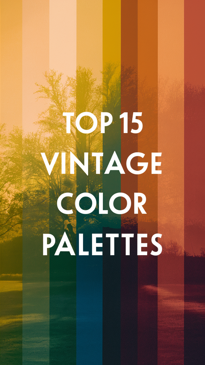
Step back in time with the most sought-after color schemes from the vintage color palette. Dive into old-fashioned paint colors and classic color combinations.
Disclosure: This post contains affiliate links. We may earn a commission at no extra cost to you.
Popular color schemes in the vintage color palette
Question:
What is the vintage color palette?
Answer:
Vintage color palette refers to a range of colors inspired by historical design styles, typically from the 1920s to the 1960s. These colors often include muted tones, pastels, and earthy hues that evoke a sense of nostalgia and timelessness. As a homeowner exploring vintage decor ideas, consider incorporating colors like mustard yellow, dusty rose, olive green, and dusty blue to create a cozy and charming atmosphere in your space.
Popular Color Schemes in the Vintage Color Palette
As a homeowner who appreciates vintage aesthetics, exploring popular color schemes in the vintage color palette can be an exciting journey. Vintage color schemes offer a unique charm and character that can instantly transform any space. Let’s delve into the world of vintage colors and discover how they can elevate your home’s design.
1. What are the most common color combinations found in vintage color schemes?
Vintage color schemes often feature soft pastel hues, earthy tones, and rich jewel colors. Common combinations include dusty rose and sage green, mustard yellow and teal, and navy blue and coral. These color pairings evoke a sense of nostalgia and warmth, making them ideal for creating a cozy and inviting atmosphere in your home.
2. How do vintage color palettes differ from modern color trends?
Unlike modern color trends that often focus on bold and vibrant hues, vintage color palettes tend to be more subdued and timeless. Vintage colors are inspired by the past, drawing from historical periods such as the Victorian era, Art Deco movement, and mid-century modern design. These colors exude a sense of sophistication and elegance that can add a touch of vintage charm to any space.
3. Are there specific eras or time periods that influence vintage color schemes?
Yes, specific eras and time periods have a significant influence on vintage color schemes. For example, the 1950s are known for their pastel pinks, blues, and mint greens, while the 1970s embraced earthy tones like avocado green and harvest gold. By understanding the color trends of different decades, you can create a cohesive vintage look that reflects a particular era’s style.
4. What emotions or feelings do vintage color schemes evoke?
Vintage color schemes evoke a sense of nostalgia, comfort, and romance. The soft, muted tones of vintage colors create a calming and soothing atmosphere, perfect for unwinding after a long day. These colors can also inspire feelings of warmth and intimacy, making your home feel like a cozy retreat from the outside world.
5. How can one incorporate vintage color schemes into contemporary design?
To incorporate vintage color schemes into contemporary design, consider using vintage-inspired furniture, decor, and textiles. Mix and match vintage colors with modern elements to create a unique and eclectic look. You can also use accent pieces like throw pillows, rugs, and artwork to introduce pops of vintage color into your space without overwhelming the overall design.
6. Are there any classic vintage color schemes that never go out of style?
Classic vintage color schemes like black and white, navy and gold, and ivory and taupe are timeless and versatile choices that never go out of style. These color combinations can be easily incorporated into any design style, from traditional to contemporary, and add a touch of elegance and sophistication to your home.
7. What are some key tips for choosing and using vintage color palettes effectively?
When choosing vintage color palettes for your home, consider the overall mood and style you want to achieve. Experiment with different color combinations and textures to create a cohesive and harmonious look. Don’t be afraid to mix vintage colors with modern elements to add a contemporary twist to your design. Remember that personal preference plays a significant role in choosing colors, so trust your instincts and select colors that resonate with you.
By exploring popular color schemes in the vintage color palette and incorporating them into your home’s design, you can create a space that is both stylish and timeless. Embrace the charm and elegance of vintage colors and let them transform your home into a cozy retreat filled with nostalgia and character.
Controversial Article: Unveiling the Truth Behind Vintage Color Palette Trends
Exploring the Vintage Color Palette: Unveiling the Secrets
Vintage color palettes have been a popular choice for homeowners seeking to recreate the charm of bygone eras in their living spaces. However, the true essence of vintage colors goes beyond just aesthetics. Let’s delve into the depths of this trend and uncover the hidden truths behind the vintage color palette.
1. Embracing Timeless Elegance with Mustard Yellow
Mustard yellow is not just a color; it’s a statement. This rich and warm hue exudes elegance and sophistication, adding a touch of vintage charm to any room. Brands like Sherwin Williams and Benjamin Moore offer exquisite mustard yellow shades like “Goldenrod” and “Majestic Gold” to elevate your decor to a whole new level.
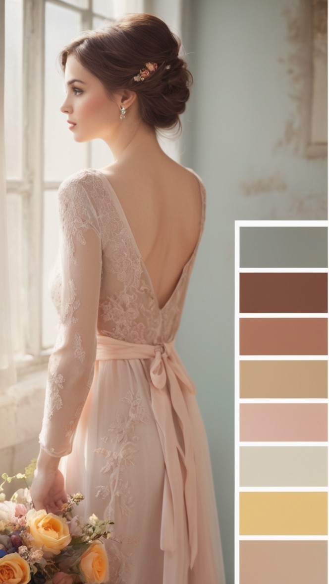
2. Reviving the Romance with Dusty Rose
Dusty rose, a delicate shade of pink with a hint of gray, is perfect for infusing a romantic and nostalgic vibe into your interiors. Benjamin Moore’s “Ballet Slippers” and Sherwin Williams’ “Charming Pink” are ideal choices to capture the essence of vintage romance and femininity.
3. Embracing Nature with Olive Green
Olive green, a versatile and earthy color, brings a sense of tranquility and connection to nature. Benjamin Moore’s “Tuscan Olive” and Sherwin Williams’ “Ripe Olive” are excellent options for incorporating this vintage-inspired hue into your design scheme.
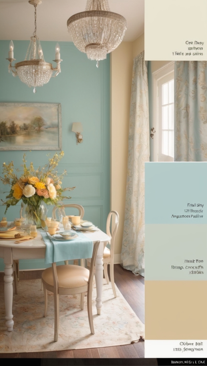
4. Channeling Serenity with Dusty Blue
Dusty blue, a soothing and calming color reminiscent of faded denim, evokes a sense of serenity and peace. Sherwin Williams’ “Misty” and Benjamin Moore’s “Quiet Moments” are perfect choices for creating a serene and timeless ambiance in your home.
5. The Art of Mixing Vintage and Modern
Combining vintage colors with modern accents can create a unique and eclectic look that is both sophisticated and inviting. Experiment with bold vintage hues like burnt orange, avocado green, and teal alongside contemporary elements to achieve a harmonious balance in your decor.
6. Creating a Cozy Retreat with Warm Neutrals
Warm neutrals like beige, cream, and taupe serve as the perfect backdrop for vintage colors, adding a sense of warmth and comfort to your space. Consider pairing these neutral tones with vintage accents to create a cozy retreat that exudes timeless elegance.
7. Infusing Drama with Jewel Tones
Jewel tones like deep burgundy, emerald green, and sapphire blue can add a touch of drama and opulence to your vintage-inspired decor. Incorporate these rich and vibrant hues in accent pieces, upholstery, or wall colors to create a luxurious and sophisticated ambiance.
8. Balancing Light and Dark Contrasts
Playing with light and dark contrasts can enhance the vintage charm of your space. Pair light pastel shades with deeper tones like charcoal gray or navy blue to create a balanced and visually appealing color scheme that exudes sophistication and style.
9. Incorporating Metallic Accents for a Touch of Glamour
Adding metallic accents like gold, brass, or copper can elevate the vintage color palette to new heights of glamour and luxury. Consider incorporating metallic finishes in lighting fixtures, furniture hardware, or accessories to add a touch of opulence and sophistication to your decor.
10. Experimenting with Unexpected Color Combinations
Dare to be different by experimenting with unexpected color combinations that challenge traditional vintage norms. Mix and match bold hues like mustard yellow with teal, dusty rose with charcoal gray, or olive green with burnt orange to create a truly unique and eclectic design scheme that reflects your individual style and personality.
11. Embracing Minimalism with Monochromatic Vintage Palettes
Embrace the simplicity and elegance of monochromatic vintage palettes by sticking to a single color family in varying shades and tones. Create a sense of harmony and sophistication by using different intensities of a color like dusty blue, olive green, or mustard yellow to achieve a minimalist yet impactful design aesthetic.
12. Personalizing Your Vintage Color Palette
Make your vintage color palette truly unique by infusing it with personal touches and meaningful elements that reflect your individual taste and style. Whether it’s incorporating heirloom pieces, sentimental artwork, or custom-made accessories, adding personal touches to your vintage decor can make it truly one-of-a-kind and special.